
Josie Bicknelle - Apr 26 2023
Designing packaging with zero experience

As some of you may know from reading previous blog posts, it’s part of my job role to design and create all of the labels and packaging for Hoadys. I thought it might be fun today to let you in a little on how I got started with this, and some of my design choices behind the different packaging we have.
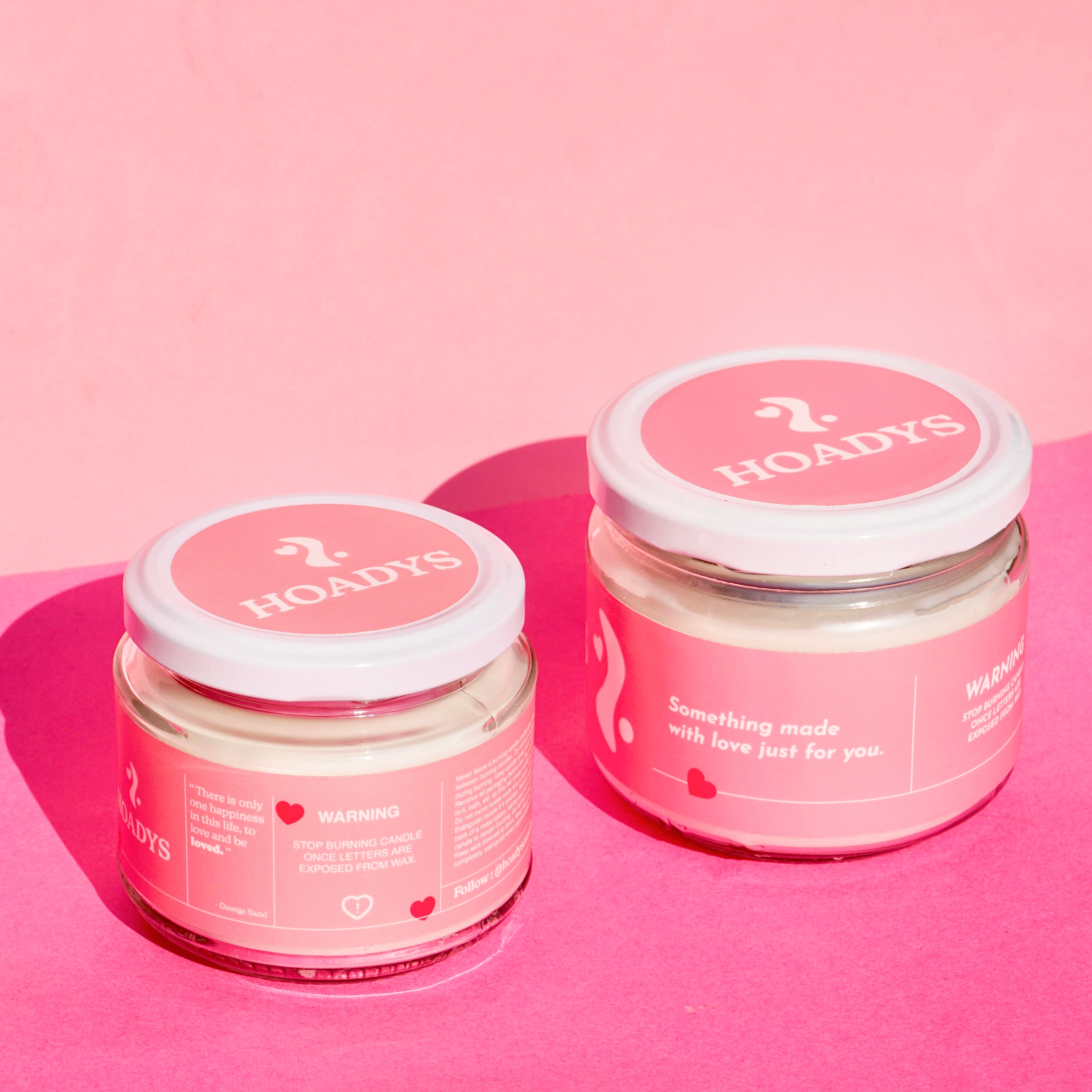
Firstly, I can’t take all of the credit for the Hoadys labels whatsoever - when Rob first started up the business, he enlisted the help of his friend, Baljan, to come up with a logo and some special valentines day packaging for him.
As the very talented designer that he is, Baljan created the Hoadys logo for us and the original pink packaging.
I remember before I'd even joined the business, Rob showed me this first sample of the packaging that had been made, and even though it was originally intended to be used only for Valentines, I insisted that he kept it as the core branding for the business. I loved the pink and red design, and thought that it screamed fun, youthful and unique - words that we wanted Hoadys to be associated with.
After some convincing that Hoadys should be pink, Rob eventually agreed, and we still use the exact same colour scheme and logo to this day. Thank You Baljan!

OG Hoadys packaging
The first lot of labels that I made completely on my own were the Hot Girl Summer labels, and I’m so proud of them.
When I came up with the idea for a ‘Hot Girl Summer’ collection, I was so specific about the vision that I wanted to create, that I thought I might as well take the job on myself.
This was going to be a collection centred around summer, confidence, and feeling like a bad bitch. I wanted the labels to be fun and bold, and to be noticeably different from our original packaging, whilst also staying visually cohesive.
I created three initial mockups for the packaging, with three different summer aesthetics. I used three different colour schemes; one pink and orange, one blue, and one green. I played around with the visual of a summer beach scene for the blue packaging, and the idea of a ‘strawberries and cream’ theme for the green packaging.


Scrapped 'HGS' collection ideas
At the time, we hadn’t decided on the scent that we would end up using for the HGS collection, so with each label I designed, we would have used a scent to match whichever one we ended up choosing - i.e. a sea salt or vanilla ice cream scent for the blue packaging, or a strawberry scent for the green.
Eventually, of course, we decided that we loved the combination of the pink and orange packaging, with a delicious juicy peach scent. I usually decide to trust my own instinct when it comes to design choices, namely due to the fact that I myself am the target market - and I was hugely drawn to the pink and orange colour scheme. It’s still my favourite candle collection we’ve ever made, and I personally can’t wait until we start producing them again this summer so that I can have them around my house!

'Hot Girl Summer' collection packaging
The next packaging that I knew I would need to make was for the Christmas collection, and I was dreading it.
As everyone knows, Christmas themed packaging always comes with a very particular colour palette - red and green.
I knew that although it would certainly stand out as being a Christmas themed collection, that I definitely didn’t want to go down this route with my packaging. Our brand has always centred around pretty, pastel colours, and the bold contrast of red and green just felt icky to me.
I tried a variety of colour combinations - red and cream (too boring), red and pink (too valentines-y). Eventually, as Rob had suggested that he’d wanted to go with a forest green colour, I settled on green and pink.
To bring in that holiday element, I added hand drawn illustrations (by me) of various Christmas-oriented objects, like hot chocolate and candy canes. It took me such a long time to create this packaging, and to be honest, by the time I was done with the final product I still didn’t like it. I still don’t - there’s something about it that feels unfinished to me, and it’s probably my least favourite design to date.

'Christmas Collection' packaging
The next collection to come around was, of course, Valentines Day. This was much more my vibe.
I knew from our original packaging that I already adore the combination of using red and pink together, and so I decided to simply flip the two colours around to have a red base rather than pink.
The one part of the Christmas collection packaging that I did actually like were the little hand drawn doodles I’d done, so I decided to incorporate the same cutesy idea into the Valentines candles - drawing little love heart sweets and bunches of flowers.
In contrast to the Christmas collection, I think the drawings looked like they were part of an overall art piece and blended in nicely, rather than looking random or childish. I also adore the way the red valentines packaging complements the pink of the original candles when they’re sitting next to each other on a shelf.


'Valentines Collection' packaging
I guarantee that if you google right now, ‘Mother’s Day packaging’, everything will be covered head to toe in florals. I’m not even sure why, it’s just a thing we do apparently.
All mum’s love flowers! And in my head, all mum’s love purple too.
It didn’t take me long to design the packaging for the mother’s day collection, and it ended up being one of my favourites. I wanted it to be simple, yet fun. I wanted it to be modern and aesthetically pleasing, whilst still being something that Mums would find attractive to have in their homes.
To my relief, I showed the mock-up to my own mum to see what she thought, and she said something along the lines of, ‘oh I quite like that actually.’ It was good enough for me.

'Mother's Day Collection' packaging
I guess now we’re up to date! All in all I’ve loved having the creative freedom to create new design ideas, and I can’t wait to see what we get up to in the future.
Some more blog posts you might like...
It's time for a change
Summertime self-hatred
We're going to Japan!
Got FOMO?
Be the first to hear about new product launches & get exclusive discount codes, straight to your inbox!